Card
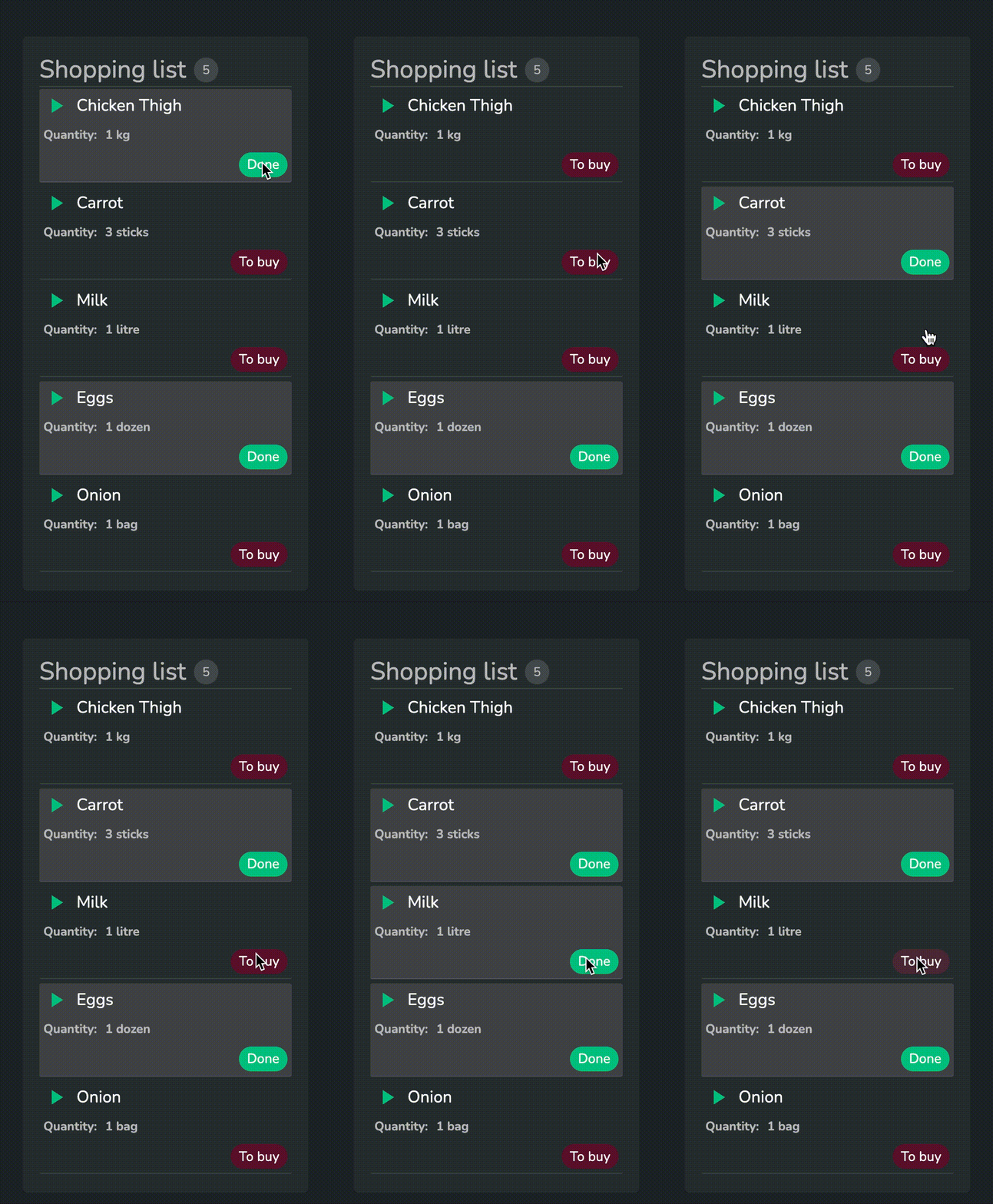
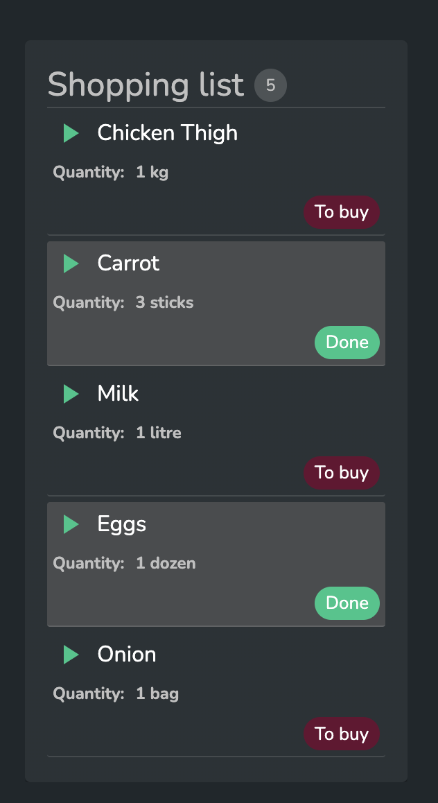
The Card component lets you display grouped data with attributes in different formats. By combining the component with workflows you can make it interactive.
Displaying Data
Data Format
The card data should be provided in standard SDD format.
{"data":[
  {
    "id":"1",
    "icon":"Warning",
    "notes":"1 kg",
    "value":"Chicken Thigh",
    "colour":"Medium",
    "colourCode":"#00C788",
    "itemStatus":"Done",
    "textColour":"#7a807b"
  },
  {
    "id":"2",
    "icon":"CheckBox",
    "notes":"3 sticks",
    "value":"Carrot",
    "colour":"Good",
    "colourCode":"#00C788",
    "itemStatus":"Done",
    "textColour":"#7a807b"
  },
  {
    "id":"3",
    "icon":"Warning",
    "notes":"1 litre",
    "value":"Milk",
    "colour":"Medium",
    "colourCode":"#670F31",
    "itemStatus":"To buy",
    "textColour":"#7a807b"
  },
  {
    "id":"4",
    "icon":"Warning",
    "notes":"1 dozen",
    "value":"Eggs",
    "colour":"Medium",
    "colourCode":"#00C788",
    "itemStatus":"Done",
    "textColour":"#7a807b"
  },
  {
    "id":"5",
    "icon":"CheckBox",
    "notes":"1 bag",
    "value":"Onion",
    "colour":"Good",
    "colourCode":"#670F31",
    "itemStatus":"To buy",
    "textColour":"#7a807b"
  }
],
  "version":"1.0.0",
  "sddFormat":"sdd/table/array-of-objects",
  "definitions":{
    "id":{
      "kind":"string",
      "optional":true
    },
    "icon":{
      "kind":"string",
      "optional":true
    },
    "notes":{
      "kind":"string",
      "optional":true
    },
    "value":{
      "kind":"string",
      "optional":true
    },
    "colour":{
      "kind":"string",
      "optional":true
    },
    "colourCode":{
      "kind":"string",
      "optional":true
    },
    "itemStatus":{
      "kind":"string",
      "optional":true
    },
    "textColour":{
      "kind":"string",
      "optional":true
    }
  }
}
Configuring Data
Each card row (item) can be configured to specify which data to display and in which format.
Displaying the value
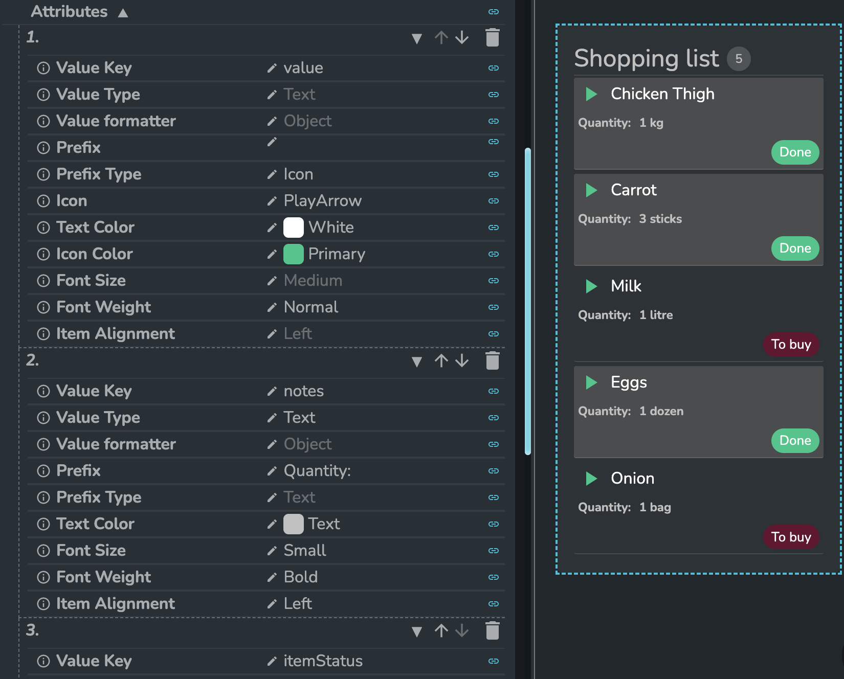
The most important part of the attribute's config is the value key and the value type. The key specifies which data item to display and the type determines how it's shown.
The available types are the following:
TextDateDatetimePill
When choosing the date and datetime the value should be a valid date string on a number. For example:
03/12/1999Mon Oct 10 20222022-09-13T08:04:49.414Z- 1665389181303 (this will be parsed to
10/10/2022, 10:06)
The user can configure how the text looks by specifying the Text Color, Font Size, and Font Weight. Additionally, the user can apply the standard Dais Value formatter to the value.
Using pills
When the user sets type of the attribute's value to Pill the following properties show up:
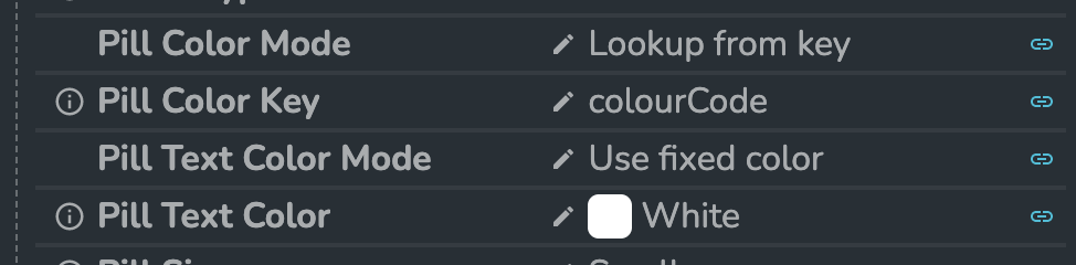
For both the pill itself and the pill text the user can either set a fixed color or look it up from a key by specifying which data item defined the color of the pill.
Additionally, the user can set the size of the pill to be Small or Medium.
Adding a prefix to the value
The user can add a prefix to each attribute. It can be a hard-coded text or an icon.
The icon can be selected from a standard Dais icon picker. Additionally, the user can select a custom color for the icon.
The icon color can be hard-coded by selecting it from the standard Dais color picker that uses the app theme colors or linked to an external data source (e.g. a workflow output).
Additional attribute config
The user can specify how the value and the optional prefix is aligned in the row by choosing one of the following options for the Item Alignment property:
LeftRightCenterSpace Between
Other properties
The user can set up selection of values in the component by specifying the ID of each row and the type of the selection - Single or Multi.
For example, when combined with a workflow the selection can determine how the attributes are displayed.